- Product

- Pricing
- Affiliate Program
- Use Cases
- Resource
 EN
EN
Many media buyers think Nutra funnels are just a guessing game. But in reality, if the buyer has experience and the team has solid business development with strong offers, finding profitable angles becomes noticeably faster. With experience, you can instantly spot what has potential and what will just burn the budget.
This guide compiles key questions to ask before launching traffic. This short analysis can save significant ad spend by filtering out weak combinations upfront.
The offer is the foundation of your entire funnel. If the product itself isn’t appealing to the audience, no creative or landing page will save it. The basic question is:
Can you explain what the product is and why someone needs it in under 5 seconds?
If not, then the story or positioning isn't clear enough.
A strong offer always has a clear formulation like:
“Natural hypertension drops made with Japanese mushroom — results in 7 days.”
The format must meet audience expectations. For example, if creams are the standard in the niche and you launch with capsules or powder, it might cause trust issues. Unusual formats can work, but they must be packaged and communicated correctly via creatives and landing pages.
New offers almost always perform better. Anything running longer than 4–6 months is usually “burned out” and will have weak conversion rates.
Packaging is your first visual contact. If it’s unclear what the product is and who it’s for, a large part of the audience will just scroll past. A strong trigger—like a unique ingredient, rare format, “European” import, or handmade label—can make a big difference.
Consider the GEO as well:
Some countries respond better to local storytelling
Others prefer products that appear foreign or Western
GOOD
Capsules for lowering blood pressure containing a Japanese mushroom, considered the "gold standard" in Japanese medicine. The product was recently introduced in the country, and the packaging is in the local language with Japanese labels, emphasizing its imported nature.
BAD
Joint cream with no brand name, packaging in English targeted at an elderly rural audience that doesn’t understand the language. No product story, no listed ingredients, and it’s been running in affiliate networks for a year already.
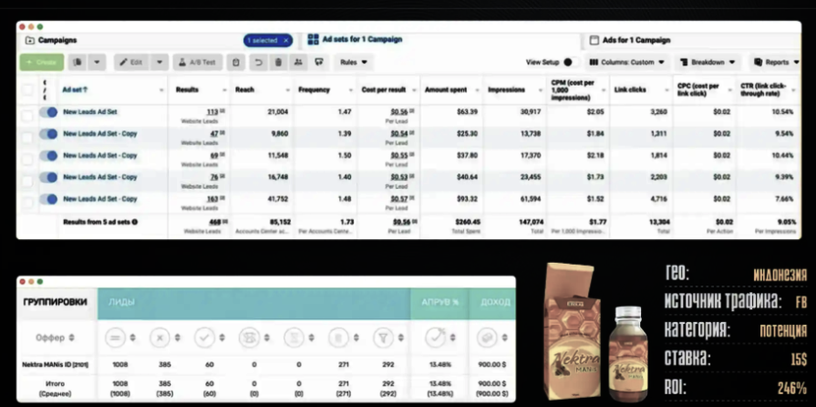
One successful case involved repositioning a basic male enhancement product. Instead of the typical capsules, the team offered it as an epimedium paste with royal jelly—a format associated with honey. This stood out, and early testing showed a strong positive reaction from the target audience due to its unique packaging and positioning.
The landing page is where the user decides: buy or bounce. Even with a strong offer, poor page design can kill conversions.
Choose the format that matches user expectations in the specific GEO:
Product page
Storytelling page from a character
Fake news article
Video landing page
What works in APAC might flop in DACH, and vice versa.
The page should not try to solve everything. If your message is diluted — “helps with vision, joints, liver” — it won’t build trust. The landing page must highlight one clear pain point and build the structure around it.
Choose a relatable hero — a doctor, expert, or “everyman” — who resonates with the local audience.
Users will always think:
“I don’t believe this”
“It takes too long”
“Too expensive”
If you don’t pre-empt these, they’ll bounce. Use:
Testimonials
Screenshots
“Approved” badges
Press mentions
Visual certificates
And make the call-to-action meaningful:
Why now? What's the benefit? What happens if I wait?
GOOD
A story told from the perspective of a doctor, explaining the root of the problem and how the product helps. The landing page addresses objections (“delivery in 3 days,” “certified in the EU”), includes testimonials with photos, research, and a clear CTA: “Offer valid until the end of the day — 50% discount on the last 200 units.”
BAD
A generic product landing page with no face or story, vague phrases like “best on the market,” stock photos, and a “Buy Now” button without explaining why the user should act immediately.
Creatives are the entry point to your funnel. If your ad fails, the user never even sees your landing page.
Does the creative logically flow into the funnel?
If your landing page has warm-up content, don’t reveal the full hook in the ad. Otherwise, the chain of curiosity → engagement → action breaks.
Stock photos and clichés like “50% off” don’t work anymore. You need a frame that grabs attention:
Emotion
Unusual object
Visual mystery
But that’s not enough. A good creative sustains interest till the end of the scroll or video.
Your creative should trigger a real reaction:
Surprise
Curiosity
Urgency
Desire to “find out more”
After watching, users should be asking: “What next?”
That’s when the landing page takes over and converts.
For stable performance, especially when testing across multiple accounts and creative hypotheses, consider using tools like MoreLogin Browser. It helps securely manage multi-account setups and keeps your ad funnel intact.
Even if the offer, creative, and landing page each seem powerful on their own — that doesn’t guarantee results. They must work together as a seamless funnel with no broken links.
Ask yourself:
“Can I clearly explain why this funnel should convert?”
If not, and you’re just launching to “see what happens,” that’s a lottery ticket.
Strong teams don’t hit Start until there’s a logical, well-structured reason why this specific combo could work.
If you can’t explain why someone should buy this product, don’t expect your user to figure it out. In this case, you’re not testing a hypothesis — you’re just wasting budget.
EN